Introduction
Cluster analysis is a powerful technique when groups of similar (or dissimilar) behaviour needs to be identified within a population of people / items / assets / sensors etc. Knowledge of common or unusual patterns of behaviour allows interventions to be targeted where, when and how they will be most effective. For example, knowing normal electricity consumption patterns by building type or usage category allows unusually high behaviour to be pinpointed and energy saving activities to be directed.
To illustrate, we cluster the typical weekly electricity patterns for a selection of meters from an anonymised building energy usage dataset provided by Schneider Electric.
Average hourly energy consumption (kWh) and temperature
The average hourly electricity consumption across a week is presented in Figure 1 below for 24 power meters. These power meters are installed at two different facilities - a laboratory and an office, and the outdoor temperature readings are also shown as a useful comparison.
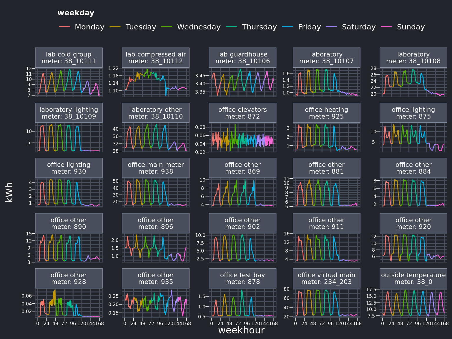
The main observations from Figure 1 are:
- Most meters record what would be expected for a standard working week, with a regular diurnal profile for Monday to Friday during working hours, and much lower consumption during the weekend.
- Similar patterns for every day are seen at two meters (the lab guardhouse - top row; office other - bottom row) and the outside temperature (bottom right).
- An irregular usage pattern is noted for the office elevators (second row, middle).
While these main patterns can be discerned visually in this instance, this method does not scale much beyond the small number of meters presented now. The next section shows how this can be improved upon.
Hierarichal Clustering of Weekly Patterns
Hierarchical clustering is one of many multi-variate clustering techniques. As the name suggests, groups or clusters are defined in a hierarchical or tree-like manner, with group members that are placed in the same branch of the tree sharing the greatest degree of similarity. Because we are examining time series or trend data, the variant used here employs dynamic time warping. This means each time series is stretched when making the similarity comparisons, to allow some leeway for identifying correlation patterns that might be slightly out of sync with one another.
The hierarchical clustering dendrogram (i.e. tree) of our meters of interest is presented on the left side of Figure 2, along with their respective weekly consumption patterns at right.
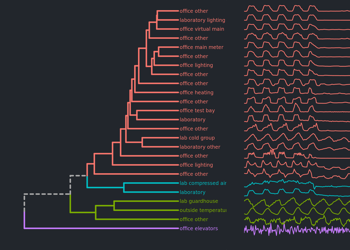
The following can be seen in Figure 2:
- The time series plots at right provide a nice visual confirmation of how effectively the clustering algorithm works, with markedly different trends being put into their own branches, and similar patterns being colocated in the same parts of the dendrogram.
- To split the dendrogram into discrete groups (as is often required in practice), we assigned four cluster groups that correspond to the first 4 branching points in the tree (and indicated with different colours). Four groups were chosen as this seemed to capture the main types of patterns that could be seen visually, and aligned with expected behaviour.
- The office elevator consumption (purple line, at bottom) was the most noticably different pattern from the rest, and was treated as such by the clustering algorithm, being the first branch split off on its own.
- The largest cluster were those meters that broadly followed a standard working week pattern with low weekend activity (indicated in red). Those positioned towards the top of this group have a smoother daily profile than those towards the bottom of the group, which exhibited greater variance or spikiness in activity throughout the working day.
- Meters with similar profiles for every day of the week can be seen in the cluster group coloured green. Within this group it is notable that peak electricity consumption for the ‘lab guardhouse’ and ‘office other’ is out of phase with the temperature peak, indicating that electricity consumption for those two locations is probably for heating. It is also interesting to note that these negatively correlated patterns are placed into the same cluster, showing the ‘stretching’ effect that the dynamic time warping method can have when determing cluster membership.
Clustering weeks for a single meter
The same method can be applied to a single meter, creating clusters of weeks with similar electricity profiles (Figure 3).
Mouse over lines to highlight individual trends. Red line shows cluster average.
Amongst the six clusters presented in Figure 3:
Cluster 1 represents a ‘normal’ work week, with energy consumption peaking towards midday of week days, and reducing during the weekend.
- Cluster 2 captures weeks with higher energy use during the work week as well as the weekend. Further investigation of high consumption weeks like these would typically seek to establish if there were legitimate operational reasons for higher electricity use, or was electricity being wasted, such as equipment or lighting not being switched off after use.
The remaining clusters are all significantly different from the first two clusters, with periods of significantly lower electricity use. These lower energy use periods probably correspond to holidays or other operational shut downs that occurred at that location. If further data was available, it would be worthwhile to investigate these outlier clusters further to establish if there were any energy saving ideas that could be put into practice.
Benefits
Cluster analysis is a valuable tool for helping organise and understand the similar patterns that may exist within your data, and doesn’t need to use time series data like we have presented here.
We have applied cluster analysis in many varied situations, with all manner of data, that has included:
- Identifying the most valuable customer segments for fast moving consumer goods products.
- Evaluating coffee brand market-positioning by value perception and flavour similarity, based on household purchasing tracked over time.
- Identifying common website visitor pathways for media companies to inform content and advertising recommendations.
- Highlighting anomalous expenditure profiles across Government departments.
- Promotional targeting of high-value Physicians based on their prescribing behaviour.
- Sentiment clustering of survey responses and survey respondents to gauge the strength of feeling for (or against) a community initiative / law change / development etc.
- Maintenance prioritisation of road section groups by condition deterioration status, to ensure maintenance activity provides the best return on investment.
The possibilities are truly endless and the results are always insightful.
To find out how CAST can boost your analytical horsepower, with cluster analysis and more, please contact us at hello@castintelligence.com.